折线图(Line Chart)
使用折线图可视化数据
输入
- 输入: 输入数据集
界面
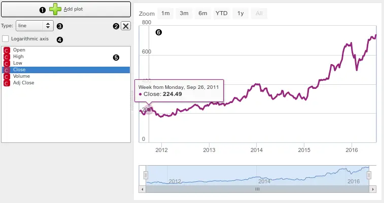
- 在当前图表下方堆叠一个新的折线图。
- 删除关联的堆叠图表。
- 要绘制的图表类型。 选项包括:线,步线,列,面积,样条线。
- 在线性和对数y轴之间切换。
- 选择要预览的特征(使用
Ctrl键选择多个序列)。 - 查看此区域中的选定系列
示例
Attach the model’s forecast to the Forecast input signal to preview it. The forecast is drawn with a dotted line and the confidence intervals as an ranged area.
反馈问题
文档有问题? 或者有其他意见和建议? 请在本文档的 Github 仓库直接反馈
点我反馈进入反馈页面不知道如何反馈, 请点击这里